proCure – the smart solution for patient-reported outcome
The task
During my Master studies in Human-Centered Computing at Reutlingen University the semester took part in the UX Challenge 2018 of the German UPA. My group (Öznur Öner, Johannes Timotheus Zillig) and I used a concept that had already been prototypically developed to facilitate the follow-up phase following cancer therapy by integrating the so-called patient-reported outcome. We thought this idea further and developed a concept of a smart wearable gadget called proCure, which can be integrated into the daily life of cancer patients. With the help of this gadget various body parameters can be measured and transmitted directly to the attending physician. Furthermore, proCure is able to issue a warning message in case of conspicuous changes of values such as pulse and temperature to which the patient can react: Either the reasons for changing the parameters are harmless, external factors such as joy or positive, emotional arousal and the patient gives feedback via proCure that his condition is OK - or the patient confirms that his values are critical and the doctor can be alerted promptly with the relevant values. Furthermore, all data collected as part of the patient-reported outcome are valuable for future research and development of personalized cancer therapies in the context of P4 medicine.
Project Documentation Website
As part of the lecture Interactive Systems of the Master's program Human-Centered Computing, a website was created which compiles the idea development and the design process of the interaction concept and GUI design. Although the most relevant content has been included in this portfolio, some aspects may be described in more detail on the (German) project website.
Hand-in paper for UX Challenge 2018 by German UPA
As part of the lecture Interactive Systems of the Master's program Human-Centered Computing, a paper describing the idea and innovative character of proCure was written both as part of the examination performance and as a submission for the UX Challenge 2018 of the German UPA. It was written by Öznur Öner, Johannes Timotheus Zillig and myself, Tanja Brodbeck and is available under the following link: Paper (Hand-in UX Challenge 2018, German UPA).
Videoprototype (Hand-in for UX-Challenge German UPA)
The idea
Cancer currently affects many people. Once the initial treatment has been carried out (start of radiotherapy / system therapy), the follow-up phase follows for the patient. It is necessary that the patient provides his doctor with as detailed information as possible about his condition so that he can adjust or optimise the medication or the entire therapy if necessary.
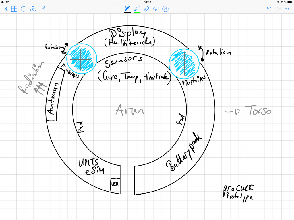
The smart solution proCure is aimed at patient groups who want to share their current condition changes digitally with their physician via the Internet after prior information and consent (electronic Patient-reported Outcome, in short: ePRO) in order to obtain optimal therapy in the follow-up phase. By means of special algorithms and logic in the background, anomalies could be detected at an early stage on the basis of vital parameters, which can be attributed, for example, to a lack of movement, and early measures could be initiated by the doctor. Data acquisition and bidirectional communication is carried out by a self-contained, gesture-controlled and portable solution without additional peripherals (e.g. mobile phone as so-called gateway). The primary interaction takes place via a touch display, in which the carrier interacts with the measuring sensors (pulses, blood oxygen content, temperature, etc.) as an actuator.
The following sketch was created by Öznur Öner. It shows the idea of a modular, smart wearable gadget to provide a smart solution for electronic patient-reported outcome:
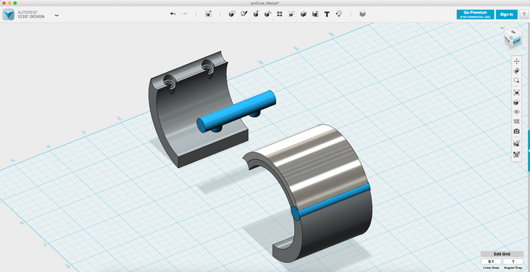
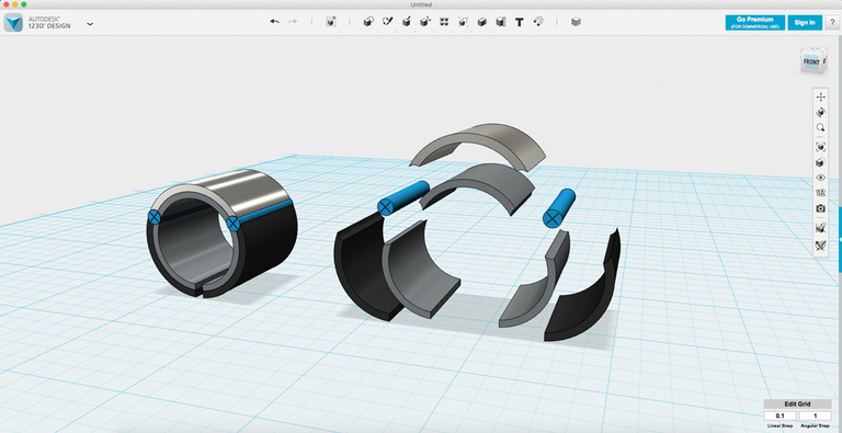
The following prototypical visualizations were created by Öznur Öner and were created with Autodesk 123d design.
The target group
The potential target group of the prototype is broad, since oncological diseases can occur at almost any age. Nevertheless, it was limited for this prototype in order to develop suitable concepts. The system can be used by young people from around 14 to pensioners over 70 years of age. The concept of the GUI (Graphical User Interface) currently concentrates on a limited target group, based on the developed persona. These are adults between 20 and 40 years of age who have to struggle with physical limitations in the form of side effects due to the oncological treatment. The general requirements are sufficient knowledge of language and writing. In addition, rudimentary motor skills and a certain amount of vision are required to interact with the display. The diversity of potential users also results in special requirements for the UX, tailored for different age groups and adapted for patients with limited vision or motor disability.
Persona

The persona is Lisa Rothkamp, 34 years young and a professional florist. She is life-affirming, sociable and helpful and wants to make successful progress in the recovery process.
– Her needs include power instead of powerlessness and stability at the time after the diagnosis.
– Her pain points are the uncertainty about her future and health, passivity and powerlessness to do nothing. Further, the standard therapy for cancer is not as effective as personalized therapy forms like P4-medicine.
– Her goals are a recovery at the quickest possible time, enough strength to continue the therapy as well as carefree living conditions even after the therapy.
Customer Journey
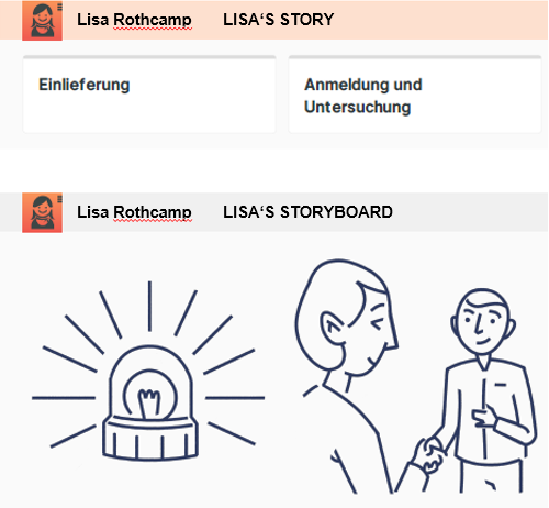
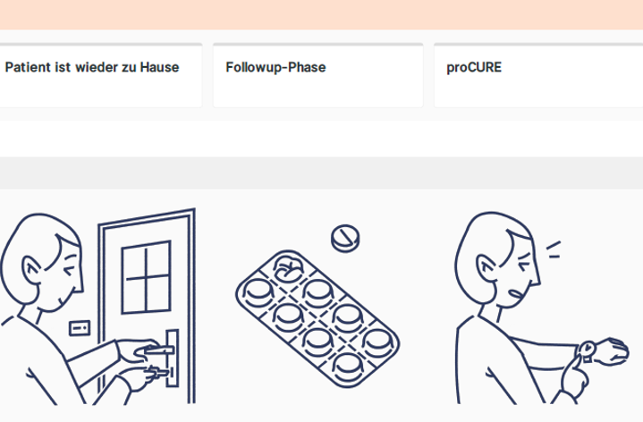
With the help of a Customer Journey, we took a closer look at the course of a cancer: Starting with the diagnosis, the subsequent shock phase and therapy, we defined the area in which our proCure concept takes effect: the follow-up phase after therapy.
The single steps in detail are:
– The hospitalization of Lisa and the ensuing registration and examination.
– Lisa is diagnosed with cancer.
– She is shocked by this diagnosis...
– ...but will soon undergo radiotherapy.
– Lisa can leave the hospital and go home after successful therapy.
– Lisa is currently in the follow-up phase after radiotherapy.
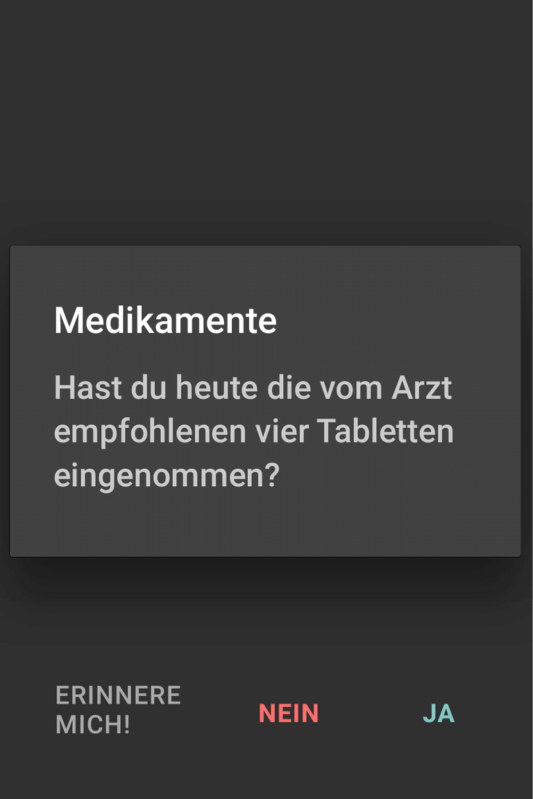
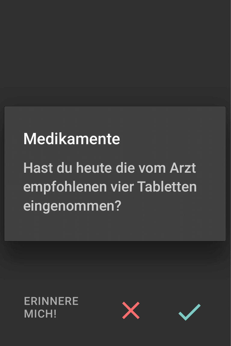
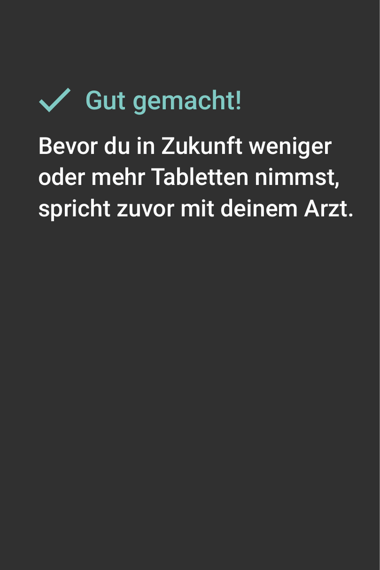
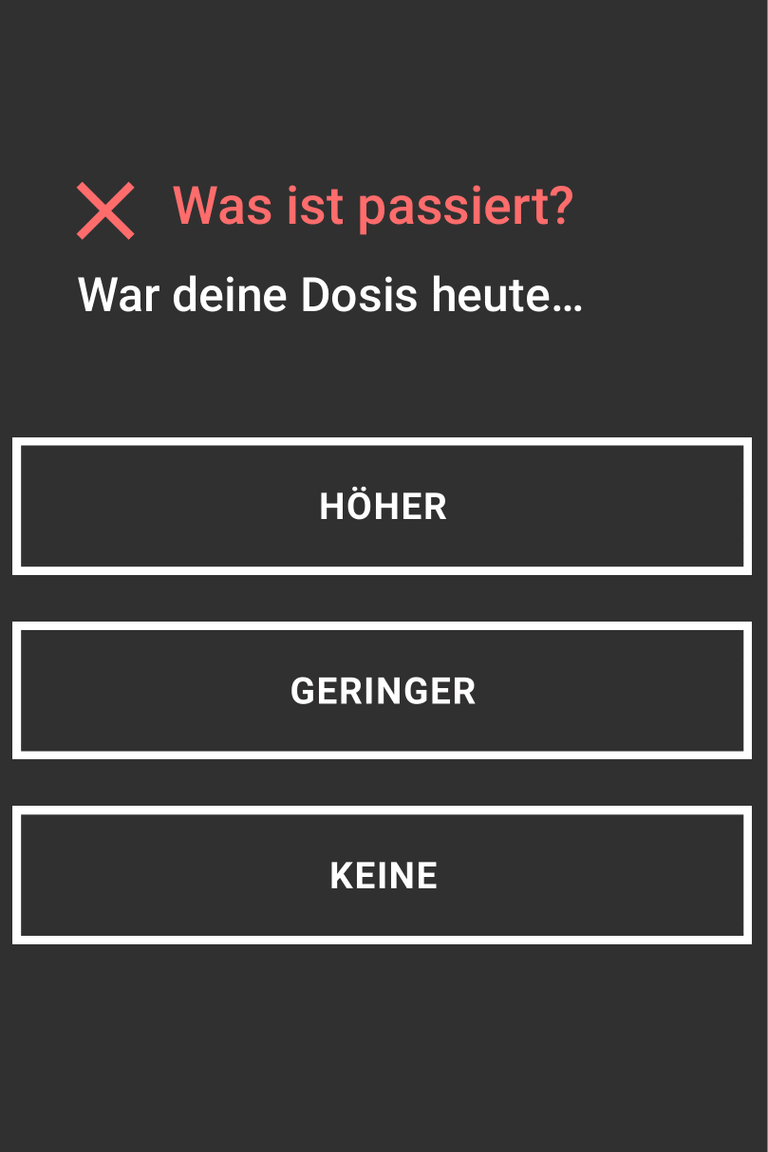
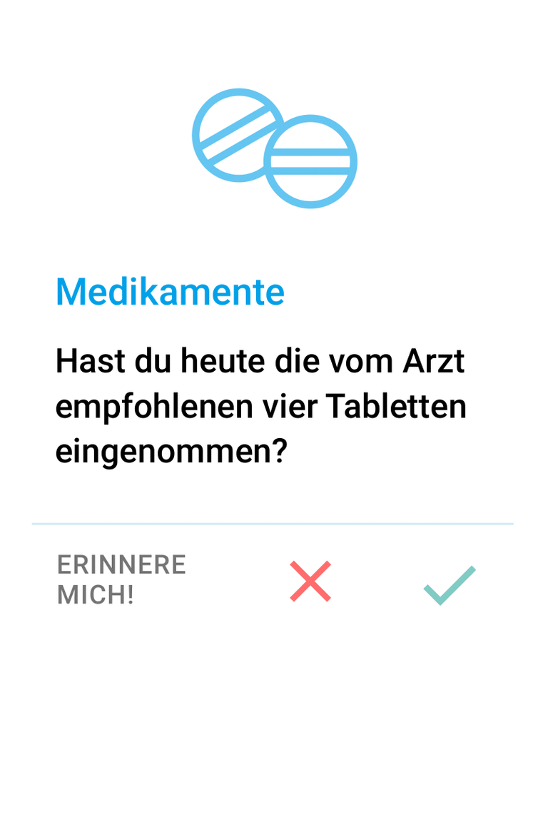
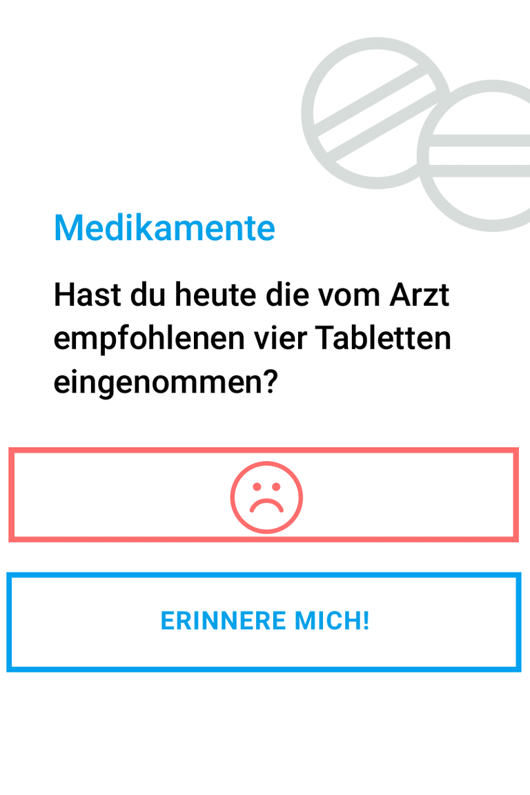
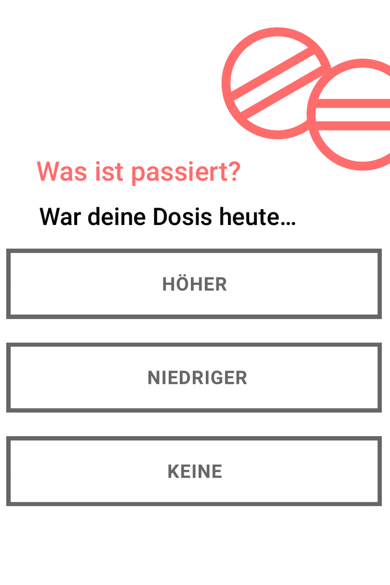
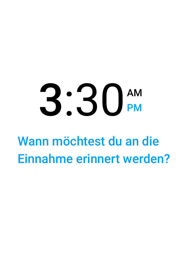
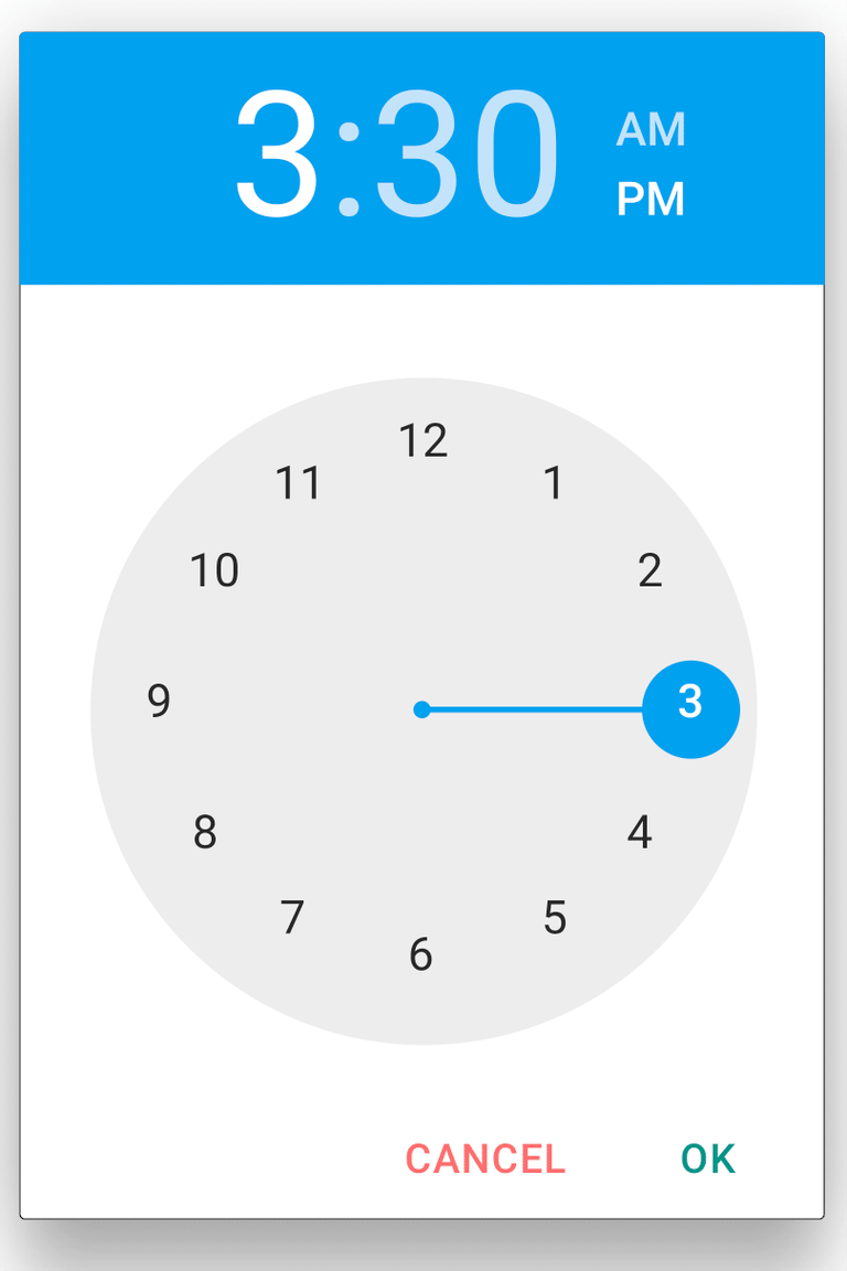
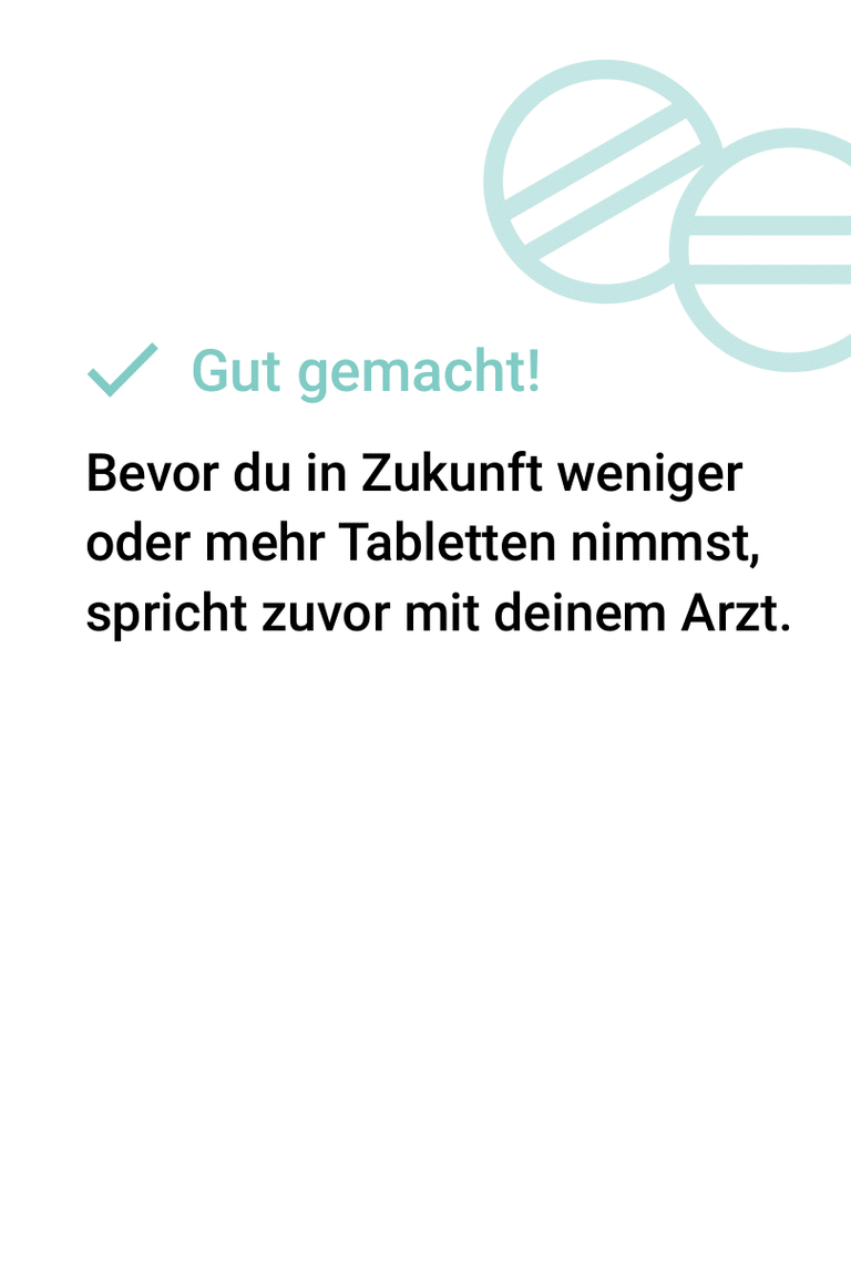
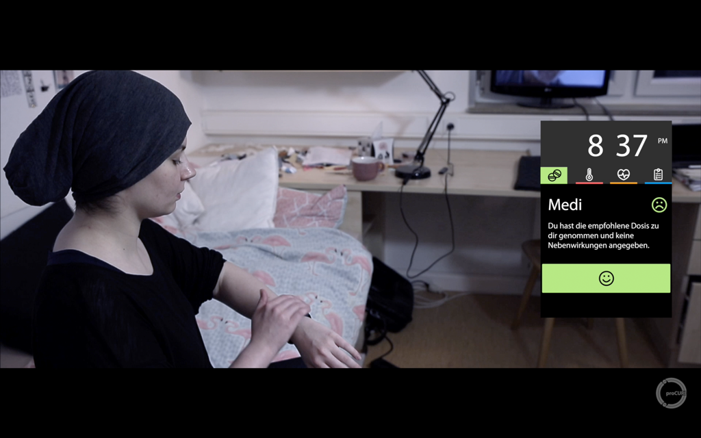
– proCure is her companion in the follow-up phase and facilitates the correct medication, for example: In addition to an intake reminder with vibration and visual feedback via the display, it is also informed about the correct dosage.
The storyboard
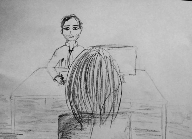
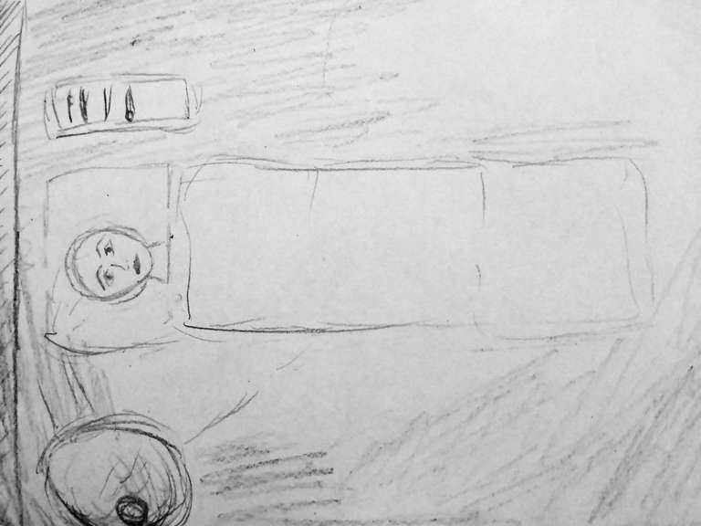
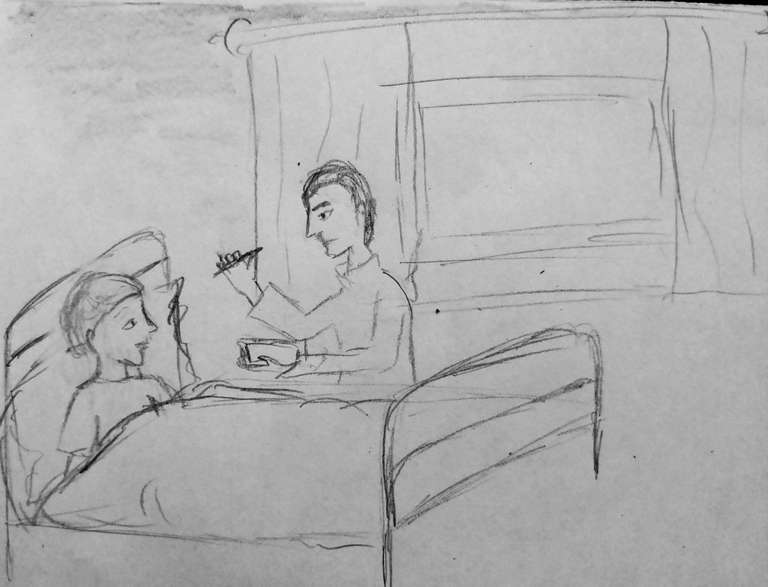
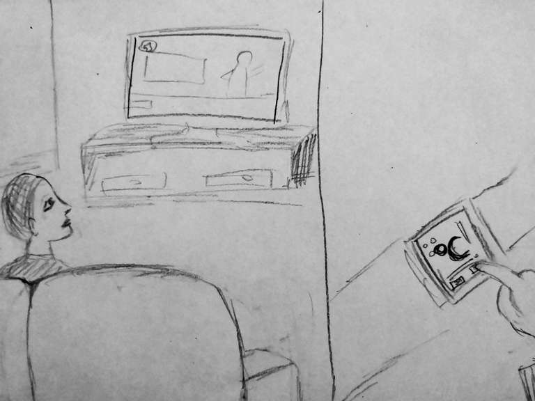
After our group was able to build empathy with the target group with the help of Persona and Customer Journey, we created a storyboard for the video prototype. It consist of the following steps, represented by the 5 images down below:
– The patient is in the doctor's office and is diagnosed with cancer.
– The patient undergoes various examinations and later finds herself in the operating theatre. Fear and fear are written on the patient's face because of the uncertainty of the future.
– The operation was successful and the patient begins radiotherapy. Your condition will be checked by the doctor, everything will be fine. Nevertheless, the therapy represents a physical and psychological burden for the patient.
– The patient is at home and is able to live her life independently again. proCure is a constant companion: In this way she transmits condition reports and body parameters directly to her doctor from the comfort of her own home.
– The patient has gathered enough strength to fully return to her old life and spend time with her friends. The product proCure does not disturb, does not stigmatize the patient as a cancer patient, but is an integral part of her life.
The design– and interaction concept
The dimensions of the GUI are based on the proCURE display. The most relevant contents are located in the middle of the curved display to ensure legibility.
Colors and contrast
The dark theme is particularly suitable for dark rooms and users who have developed side effects such as light sensitivity due to active or recent chemotherapy. In addition, white text on a dark background is considered more legible by some people.
The bright theme is particularly suitable for sunny rooms and active users who like to spend time outdoors in the sunlight. In addition, some users may prefer black text on a white background, as they perceive this as more legible.
The introduced color coding takes up familiar metaphors (similar to a traffic light) and common interaction patterns:
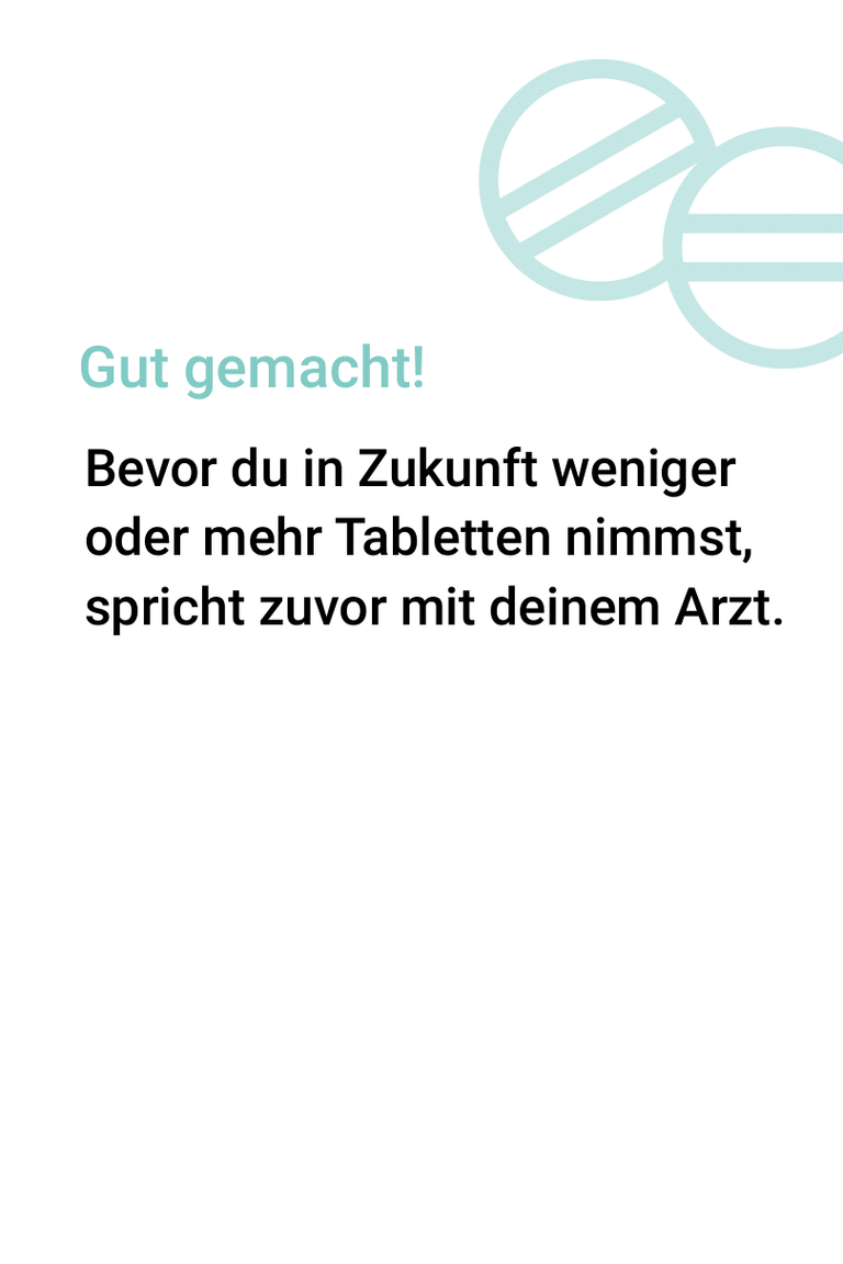
– Green stands for positive confirmations and areas where a positive body condition value or general positive status could be determined (such as correct medication intake).
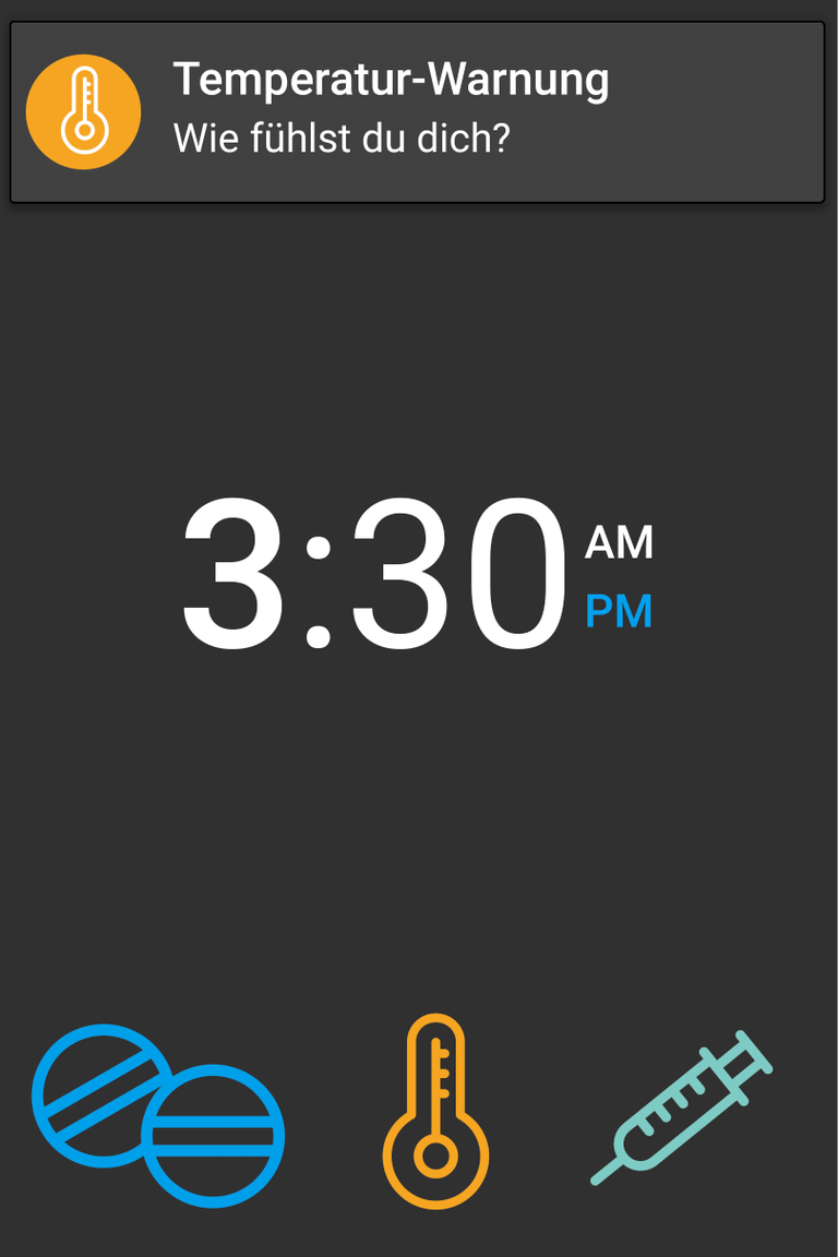
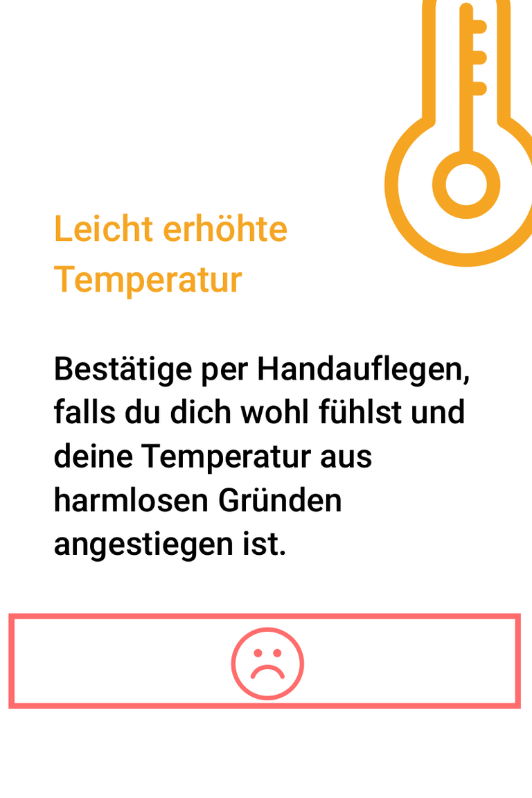
– Orange stands for active warnings in which the user is asked for feedback for better categorisation (e.g. an active warning due to an increased pulse reading).
– Red stands for the negative confirmation of an actual bad condition or for warnings and measurements of critical body parameters.
The colours and contrasts were tested against the accessibility guidelines for accessible web content (WCAG).
Recognizability
The basic structure of the layout has been retained in both the dark and light theme to allow a smooth, irritation-free change between both views. The color coding is identical in both themes.
Navigation and icons
For basic navigation in the menu to the different functions and sections of the proCure, icons that can be captured quickly instead of text were used. Clearly recognizable icons have been designed that are easy to read in both themes.
The sections are represented by the following icons:
– Medication by the tablet symbol
– Body temperature through the thermometer
– Pulse measurement through the heart with pulse line
– Questionnaires for patient-reported-outcome via the clipboard/checklist document
Interactions
For our interaction concept, we consulted a consultant from Reutlingen University (Markus Lemcke) to ensure accessibility for our product concept. In this way, we developed three key forms of interaction:
Tap/Touch

The display surface of the proCure reacts to touch/tips and thus takes up the familiar forms of interaction of smartphones and other wearables.
Especially those design elements that appear on the display due to a change in the state of the body parameters and require a status report by the user fill large areas of the screen and facilitate fast, intuitive operation through strong contrasts and icons instead of text.
Covering

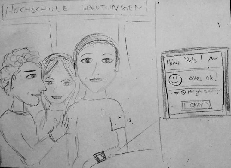
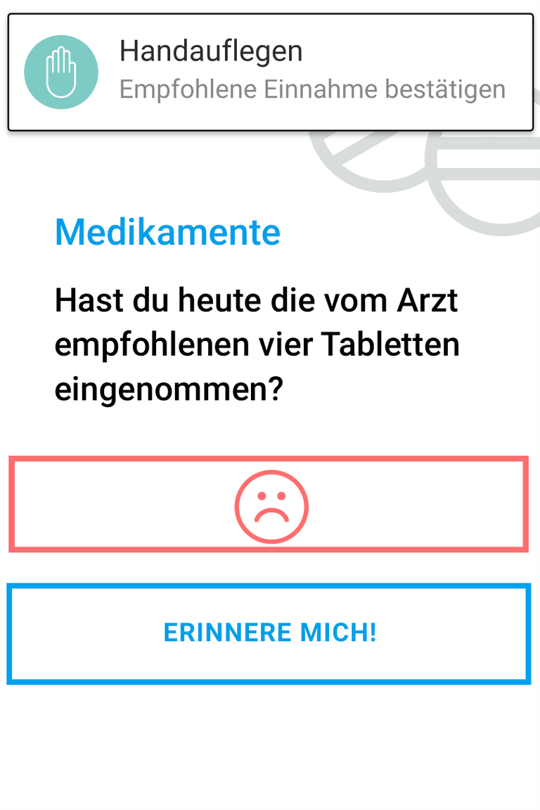
Covering the display was integrated as a further form of interaction to depict a metaphor of the laying on of hands. If proCure issues a warning, the wearer can indicate by covering the display that his condition is OK and that the change in condition of his body parameters was caused by harmless influences. Furthermore, some of the user's feedback gestures can be performed by this method even if the mobility of the hands in particular is restricted, e.g. due to a stroke.
Conditioning and vibration

In addition to visual warnings, proCure also uses vibrations to indicate a change in the state of body parameters. With this knowledge, the user is able to correctly interpret the vibrations of the device, so that the longer he uses the device and gets to know both himself and proCure better, the more confident and confident feedback he can give. This can then also be done without looking at the display, so that the user is able to follow conversations attentively, maintain eye contact with the other party and still generate feedback for the patient-reported outcome.
This project was a group work of Öznur Öner, Johannes Timotheus Zillig and me, Tanja Brodbeck.
Although the most relevant content has been included in this portfolio, some aspects may be described in more detail on the (German) project website.

